|
|
Post by toaster on Sept 15, 2010 21:58:08 GMT -5
Hi all. I've mentioned over on SCN that one of the things I really liked about FT was the graphical SSD's, they were practical, easy to use and fun. With that in mind I've been thinking about a graphical SSD for CBF since I got it, the big issue is the weapons, it would be easy enough to have an icon for each type of weapon but then you would need a key and a chart of weapons stats and the whole point of the exercise is to reduce the amount of paper. Eventually I realized that its all d6 (square) or d10 (diamond) so the weapon symbol is the attack die type and the fire arc markers show penetration die type. With this layout 9 ships per page are easy and if your willing to write neatly you can go up to 18 (3x6 on landscape orientation). Let me know what you all think. Robert Attachments:
|
|
|
|
Post by toaster on Sept 15, 2010 21:59:41 GMT -5
Ok seems I can only attach one image per post. Attachments:
|
|
|
|
Post by toaster on Sept 15, 2010 22:00:26 GMT -5
and heres a sample for a couple of the ships from the basic rules. Attachments:
|
|
|
|
Post by TheDreadnought on Sept 16, 2010 7:49:20 GMT -5
Wow. These are awesome! Great work! Ceratinly seems like a great option you've worked out here for the people who prefer the graphical approach. It's true that you should be able to fit a lot more of these on a page - which is always a good thing.
Do you want to post these in the files section of the yahoo group? I can do it if you don't have time.
|
|
|
|
Post by flutterz on Sept 16, 2010 13:15:10 GMT -5
Wow, those are really fantastic, Toaster.
I'm sold, I'm going to work out some of my ship designs with those icons as I was just lamenting how much I like the Full Thrust SSD's as well.
I'm thinking some kind of snazzy icons in the center of the weapons would do well aesthetically (could be just a black background with a letter in the middle). I could come up with something, but a standard lexicon would of course be useful.
Again, excellent work.
|
|
|
|
Post by toaster on Sept 16, 2010 14:35:43 GMT -5
Glad you like them, good sugestion about adding them to the yahoo group, I'll get it done some time today.
Robert
|
|
|
|
Post by toaster on Sept 16, 2010 16:48:44 GMT -5
flutterz, thats were the number of guns in the hardpoint goes.
|
|
|
|
Post by warchariot on Sept 16, 2010 17:40:45 GMT -5
"I'm thinking some kind of snazzy icons in the center of the weapons..."
I like the idea of the icon/name so I can say...my 3 Heavy Rail Guns are shooting at... Otherwise, I won't feel the flavor of the game. As you pointed out, there are d6 and d10 weapons. so they all feel alike without the icon/name.
|
|
|
|
Post by flutterz on Sept 16, 2010 19:07:30 GMT -5
Well, I thought this was such a good idea that I went a bit OCD on the old Photoshop and came up with a rough draft sort of thing.... I don't know if the attachment is going to work, so you can check out this link i221.photobucket.com/albums/dd319/blazingbrushminis/Spacey%20Stuff/UnionBCB-Validation.jpg?t=1284681785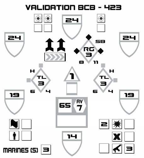 It's Toasters conventions except that I went with colors for the Penetration damage bonuses (gray is no bonus, gray with a black dot will be +1, black is +2 and black with a gray dot is +3). I just used the public domain icons out of photoshop as well. Still needs a lot of work, but you get the idea (those are turbo lasers and a railgun, icons would be better of course). Those are actually supposed to be cluster missiles, but I haven't worked out the designator yet (I was thinking a white dot, but it was kind of ugly so far). Attachments:
|
|
|
|
Post by toaster on Sept 16, 2010 19:18:31 GMT -5
I like it, the firecon icons work really well, I'll have to change to those myself (been using the old FT conventions). I know you've put the engines above the hull box to make eveything fit but it just feels wrong to have them in the middle. Definately agree that restoring flavour to the weapons is a good idea.
Robert
|
|
|
|
Post by flutterz on Sept 16, 2010 19:45:51 GMT -5
Yeah, my drive unit is probably the worst part in general --> wrong place and quite underwhelming. A work in progress.
Really great idea though, Robert. It's hard to look at the old displays this little revolution and I never would have thought of those conventions you came up with.
|
|
|
|
Post by flutterz on Sept 16, 2010 23:03:10 GMT -5
Alright, I've got a bit more worked out and shown on that same ship from before. It's still a railgun, Turbo Lasers and cluster missiles (the Rail icon is just a place holder). I'm thinking the mkagazines can have those sergeant stripes in both gray and black, with black representing five missiles to the gray's single shot (saves space). I'm working on a master weapon list as well as a blank ship sheet, but the weapons will probably take a good while to get right. Attachments:
|
|
|
|
Post by flutterz on Sept 17, 2010 20:54:05 GMT -5
Alright, a little further - I'm working on doing up all the beam weapons first and I also spiffed the basic display format. The layout of the weapons determines which hardpoint they're loaded into, so you're looking at a heavy phaser in slot 1, an ion cannon in slot 2, disruptors in slots 3 & 5 and then interceptors in slot 4. The disruptor icon was taken from an atom style icon, but with scaling issues it's looking more like "fire the flower cannons, ensign!" This ship only has one PDF unit as the faction has level 5 lasers, so their task force will be crawling with mass 40 screen destroyers. Attachments:
|
|
|
|
Post by toaster on Sept 18, 2010 1:45:32 GMT -5
Definately like that middle section now, agree about the flower cannon as well but what to do about it I'm not so sure. I'm definately looking forward to seeing the rest of your work on my idea.
Robert
|
|
|
|
Post by warchariot on Sept 18, 2010 23:43:07 GMT -5
Nice work, I like this better. Still, I would like to see the lower icons for repair, sec forces, ect pulled into the ship design area somehow. They look like after thoughts on the outside, almost like their not part of the ship.
|
|
|
|
Post by flutterz on Sept 19, 2010 17:52:10 GMT -5
Thanks guys, it's coming along and should be wrapped up pretty soon, actually. To integrate the assorted end boxes might be doable and would look cool, but it'll pinch the main body pretty tight if we're going to have the rear shields hindmost on the display, so I think I'll get something functional up first and look into reworking that guy as a more long term venture. Here's a tentative look at the beam weapons - I need to cut the "compact" feature off of the gat-lasers and reposition the rest so that they fit better, but otherwise I think it's about done. I must confess I'm bugging out on the project and just want to get it done rather than get it transcendent at this point. Heck of a lot of photoshopping and the misses has offered some subtle rebukes. ;D But it's gonna get done - real close. I need to tidy up the autocannons and SSD base and then it's a matter of the ordinance weapons (which should be easy and more fun too). Attachments:
|
|
unclejoe
Lieutenant Commander
Posts: 199
|
Post by unclejoe on Sept 20, 2010 12:43:37 GMT -5
As nice as these look, I hope they dont become 'the standard'. I'm actually quite happy with words and tables...its much easier for me than trying to remember which little symbol means what weapon again...  |
|
|
|
Post by TheDreadnought on Sept 20, 2010 12:54:40 GMT -5
I wouldn't worry about that. Some people love their graphical SSDs though. Nothing wrong w/ that.
I think its great that these guys are coming up with such a great system. There is a big chunk of people who like it that way, now they will have something to use.
I do agree that if you know the symbols, graphical SSDs are a much more efficient way of presenting the information. There is no way you could fit 9 ships to a page in classical format.
But it also steepens the learning curve for new players. Which is why its best kept as an option for advanced players who want to use it.
|
|
|
|
Post by toaster on Sept 20, 2010 14:36:05 GMT -5
@ UncleJoe, thats the whole point of the symbol convention, the pretty icon is just window dressing. To play the game you pick up dice of the same shape as the outline box and roll. the only extra memory is which numer is hull damage and which is shield damage and that is arranged the same way as the standard table (shield dam then hull dam).
Robert
|
|
|
|
Post by warchariot on Sept 20, 2010 19:39:51 GMT -5
Thanks for all the work on these. I like them, but won't go through the effort to make them myself. It is so easy to build and print. Now if there were a program that printed this way...
|
|


